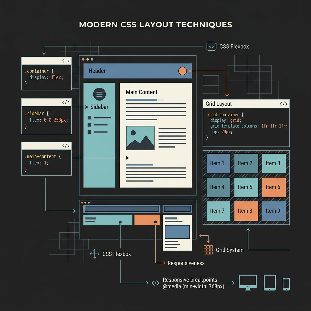
The New Era of CSS: If Statements, Shape Functions, and More
CSS is changing faster than it has in years. We are moving past basic positioning and typography tweaks into areas like inline logic and canvas-style drawing. These are features that used to force us to write heavy JavaScript or load custom SVGs. Several new layout and logic features are landing in browsers, and they change how we structure stylesheets.
CSS if() statements are real
The most significant update is the introduction of conditional logic inside property values. We have used media queries and @supports blocks for high-level layout rules, but the proposed if() function lets you set values conditionally right on the property.
This function acts like a style query. It checks the value of a custom property and applies a style based on the result. You can build multiple button variants with a single ruleset:
.btn {
  --variant: default;

  background: if(
    style(--variant: primary) ? var(--blue-600): style(--variant: danger) ?
      var(--red-600): style(--variant: success) ? var(--green-600): var(--gray-200)
  );

  color: if(
    style(--variant: primary) ? #fff: style(--variant: danger) ? #fff: style(--variant: success) ?
      #fff: var(--gray-900)
  );

  border-color: if(
    style(--variant: primary) ? var(--blue-700): style(--variant: danger) ?
      var(--red-700): style(--variant: success) ? var(--green-700): var(--gray-400)
  );
}
To style the buttons, you only need to change the custom property on the markup:
<button class="btn" style="--variant: primary">Save</button>
<button class="btn" style="--variant: danger">Delete</button>
<button class="btn" style="--variant: success">Confirm</button>
Under the traditional approach, each variant required its own class and a block of overrides:
.btn {
  background: var(--gray-200);
  color: var(--gray-900);
}
.btn--primary {
  background: var(--blue-600);
  color: #fff;
  border-color: var(--blue-700);
}
.btn--danger {
  background: var(--red-600);
  color: #fff;
  border-color: var(--red-700);
}
.btn--success {
  background: var(--green-600);
  color: #fff;
  border-color: var(--green-700);
}
The new if() method reduces repetitive CSS selectors. You can manage state changes in a single ruleset rather than writing overlapping styles. Frameworks can pass options through custom properties instead of toggling classes in JavaScript.
The shape() function: drawing with CSS
We no longer have to rely on the complex coordinate math of the polygon() function for clipping paths. The new shape() function brings SVG-style path commands like move, hline, vline, and curve directly into CSS.
For example, when creating a speech bubble, the old polygon() approach forced you to plot every coordinate manually:
.speech-bubble {
  clip-path: polygon(0% 0%, 100% 0%, 100% 75%, 75% 75%, 50% 100%, 50% 75%, 0% 75%);
}
Adjusting the angle of the tail was difficult without a visual editor. The shape() function makes the coordinates readable:
.speech-bubble {
  clip-path: shape(from 0% 0%) {
    hline to 100%;
    vline to 75%;
    hline to 75%;
    line to 50% 100%;   /* tip of the tail */
    line to 50% 75%;
    hline to 0%;
    close;
  };
}
The commands describe the drawing steps directly. You can read the code to understand the layout rather than mapping points on a grid. Tweak the tail, add curves, or animate the shape without needing external vector editors.
Text wrap: balance vs. pretty
Web typography has always had trouble avoiding orphans, which occur when a single word hangs on a new line at the end of a block of text. We now have two options for the text-wrap property to address this:
.article-title {
  text-wrap: balance;
}

.article-body p {
  text-wrap: pretty;
}
Here is how the two values behave:
balanceredistributes the text so every line is roughly the same width. This works well for headlines and short callouts. The browser evaluates all possible line breaks to find the most balanced option. Because this layout math is demanding, browsers limit the calculation to about six lines of text. Longer text blocks will fall back to normal wrapping.prettyworks by adjusting only the last few lines of a block of text to prevent orphans. It leaves the rest of the paragraph alone, making it faster to process. You can apply it to body copy without creating rendering bottlenecks.
Applying balance to all text on a page can slow down rendering. Use it on headings and short UI elements, and use pretty for paragraphs to clean up orphans without a performance hit.
Scrollbar styling is standardized
The vendor-prefixed -webkit scrollbar selectors are being phased out. Standardizing these properties means you no longer need to write separate rules for different engines:
/* Old method: -webkit pseudo-elements */
.container::-webkit-scrollbar {
  width: 8px;
}
.container::-webkit-scrollbar-track {
  background: #f1f1f1;
}
.container::-webkit-scrollbar-thumb {
  background: #888;
  border-radius: 4px;
}

/* New method: standardized properties */
.container {
  scrollbar-width: thin;
  scrollbar-color: #888 transparent;
}
Standard properties replace a long block of vendor-specific pseudo-elements. The scrollbar-width property takes auto, thin, or none. The scrollbar-color property accepts the thumb color followed by the track color. While you lose some granular control, like the ability to style hover states on the scrollbar parts, it handles most use cases with much cleaner code.
If you must support older browsers, you should keep both sets of styles. Modern browsers will use the standard properties and ignore the -webkit rules.
Content visibility: rendering performance
The content-visibility property is a straightforward way to speed up rendering. It tells the browser to skip layout and painting work for elements that are currently off-screen. It works like virtual scrolling libraries, but it is built directly into the browser rendering engine.
.article-section {
  content-visibility: auto;
  contain-intrinsic-size: auto 500px;
}
The contain-intrinsic-size property is necessary here. When the browser skips rendering an off-screen element, it does not know the element’s actual height. Without a size estimate, the page height would jump as you scroll. Using contain-intrinsic-size: auto 500px gives the browser a placeholder height of 500px until the element is rendered, and the auto keyword tells the browser to cache the actual height once the element is visible.
This property can significantly cut down initial load times on pages with long feeds or documentation. Browsers that do not support the property will simply render the layout normally.
@starting-style: entry transitions
Animating an element when it is added to the DOM or when its display property changes from none to visible usually required helper classes or JavaScript triggers. The @starting-style rule handles this in pure CSS:
.dialog {
  opacity: 1;
  transform: translateY(0);
  transition:
    opacity 0.3s,
    transform 0.3s;
}

@starting-style {
  .dialog {
    opacity: 0;
    transform: translateY(20px);
  }
}
When the .dialog element enters the DOM, it uses the styles defined in @starting-style as its starting point and transitions to its active styles. You do not need to use requestAnimationFrame or toggle classes after a delay. This makes it easier to animate modals, dialogs, and popovers.
To transition properties that do not support smooth interpolation, like the display property, you can pair this with transition-behavior: allow-discrete.
Anchor positioning: tooltips without JavaScript
CSS anchor positioning lets you attach an element directly to a target element. You no longer need to write getBoundingClientRect() loops or absolute positioning math to position popups.
.trigger {
  anchor-name: --my-trigger;
}

.tooltip {
  position: fixed;
  position-anchor: --my-trigger;
  top: anchor(bottom);
  left: anchor(center);
  translate: -50% 8px;
}
The tooltip stays aligned with the .trigger element, even when the page layouts change or when the user scrolls the container. You can also use the position-try-fallbacks property to set alternative positions if the tooltip is cut off at the edge of the viewport.
This feature is particularly useful for dropdown menus, date selectors, and tooltips, allowing you to position them without running calculations on the main thread.
Browser support and progressive enhancement
These features are at different stages of browser adoption. Here is how you can use them:
- Safe to use now:
text-wrap: pretty,scrollbar-color,content-visibility, and@starting-style. They degrade gracefully; browsers that do not support them will show default styles. - Use with
@supports: Anchor positioning andshape(). Wrap these styles in a feature query and provide a basic absolute positioning fallback. - Experimental: The
if()statement is still in development. You can use it in local experiments, but it is not ready for production environments.
Because browsers ignore CSS properties they do not recognize, you can write progressive enhancements without breaking the layout for older clients.