CSS grid finally clicked for me: here’s what made it stick
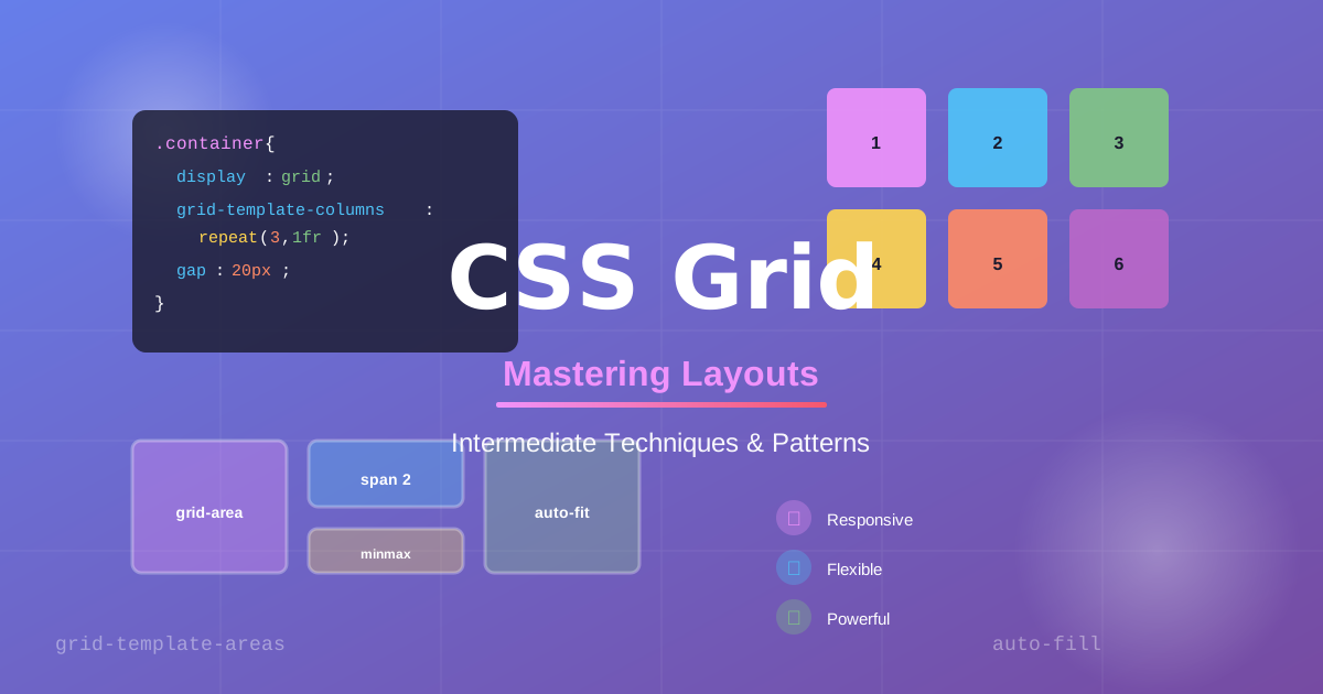
Storytime: I spent an embarrassing amount of time using CSS Grid like a slightly better Flexbox. Two-dimensional layout? Sure. But I was still writing grid-template-columns: repeat(3, 1fr) and calling it a day, completely ignoring half the power sitting right there in the spec.
Then I had to build a magazine-style layout with overlapping elements, and everything changed.
Let me show you what I wish someone had explained to me earlier, focusing on the mental model that makes the syntax actually make sense.
Why grid is different (and why that matters)
Flexbox thinks in one dimension. You get a row or a column, and items flow along it. Grid thinks in two dimensions simultaneously. You work with rows and columns at the same time, placing items explicitly on that canvas.
That distinction sounds small, but it changes everything. Once you internalize it, you stop fighting the layout and start composing it like a designer.
Before you do anything
Open your browser DevTools. Seriously. Chrome and Firefox both have a dedicated Grid inspector that shows you the grid lines, named areas, and track sizes as you work. It is one of the best developer experience improvements in browser tooling in recent years, and you will want it open the whole time.
Setting up your grid
Let’s start with a real example: a simple article layout with a header, sidebar, main content, and footer.
<div class="layout">
  <header>Header</header>
  <aside>Sidebar</aside>
  <main>Main Content</main>
  <footer>Footer</footer>
</div>.layout {
display: grid;
grid-template-columns: 250px 1fr;
grid-template-rows: auto 1fr auto;
grid-template-areas:
"header header"
"sidebar main"
"footer footer";
min-height: 100vh;
}
header {
grid-area: header;
}
aside {
grid-area: sidebar;
}
main {
grid-area: main;
}
footer {
grid-area: footer;
}Notice grid-template-areas. That is the part that made Grid click for me. You are drawing the layout in ASCII art. It is visual, readable, and when you come back to it three months later, you will immediately know what is happening.
The part everyone skips: placement
Here is where Grid gets genuinely exciting. Items do not have to follow document order.
.hero-image {
  grid-column: 1 / -1; /* span the full width */
  grid-row: 1 / 3; /* overlap into the second row */
}
That -1 is shorthand for “the last grid line.” I use it constantly because you do not have to know how many columns you have to span all of them.
This is how you get overlapping elements without absolute positioning hacks. The image sits in the flow of the grid, but visually overlaps the content below it. It is clean, intentional, and accessible.
Common pitfall: implicit vs. explicit grid
One thing that tripped me up early: if you place an item outside your defined grid, the browser creates implicit tracks to hold it. By default, those tracks are auto-sized, which often means they collapse to zero height.
/* Fix implicit row sizing */
.layout {
  grid-auto-rows: minmax(100px, auto);
}
Add grid-auto-rows to your container and you will save yourself a debugging session.
Level up: minmax() and auto-fill
.card-grid {
  display: grid;
  grid-template-columns: repeat(auto-fill, minmax(280px, 1fr));
  gap: 1.5rem;
}
This is one of my favorite CSS patterns. Cards automatically reflow from one to two or three columns based on available space, without requiring media queries. The auto-fill keyword creates as many tracks as will fit, while minmax(280px, 1fr) specifies that each track must be at least 280px wide but can grow to fill remaining space.
It is responsive design without the breakpoint math.
Accessibility check
Grid does not reorder elements in the DOM, only visually. That means screen readers and keyboard navigation still follow the document order. If your visual order differs significantly from your source order, double-check the experience with a screen reader. A layout that looks great but reads backward is still broken.
Go build something
CSS Grid rewards experimentation. The spec is large, but you do not need all of it on day one. Start with grid-template-areas for named layouts, add auto-fill and minmax for responsive card grids, and reach for explicit placement when you need overlapping elements.
The browser DevTools inspector is your friend here. Draw a grid, inspect it, break it, and fix it. That is the best way to make it stick.